
Identity and web design for a boutique personal training business
Magic Pill Training
Project // Magic Pill Training Role // Product Designer Timeline // 4 Weeks Toolbox // Pencil +Paper, Sketch, Adobe Suite
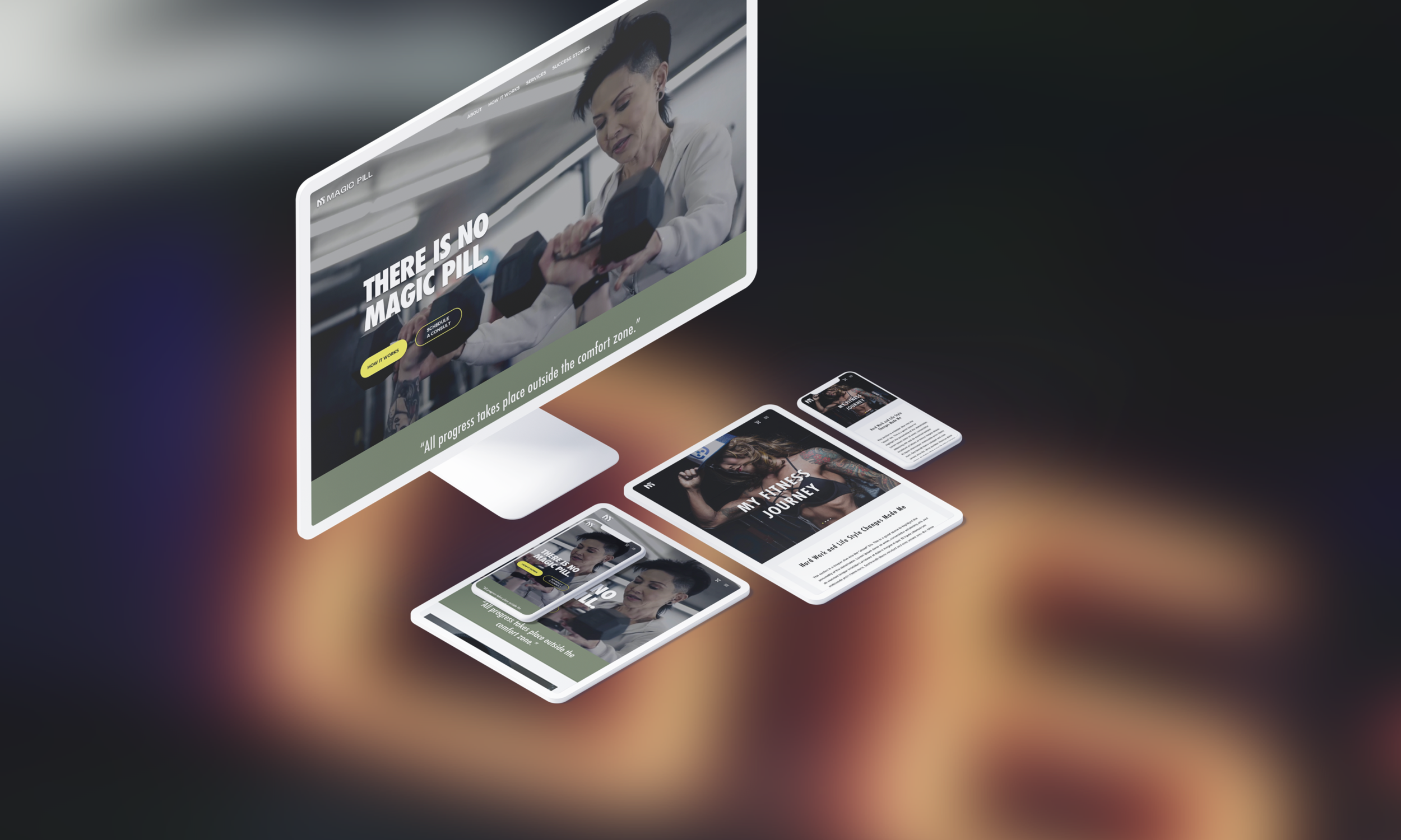
Branding and a responsive website made for a bad-ass local personal training business
As the saying goes, if it sounds too good to be true, it probably is. We all want to be fit and fabulous with minimal effort and eat whatever we want. Unfortunately, THERE IS NO MAGIC PILL, only hard work and lifestyle changes.
Magic Pill Training is a small personal training business run by Dakota Ushigome in Portland, Oregon. Dakota brings her twist on training and nutrition to her clients, specifically customized to individual goals.
In four weeks, I helped research, brand, and design a responsive website to provide an engaging, user-centric experience.

Market Research
Provided that the U.S. personal training industry continues to grow at the conservative rate of 3.2% (2012-2017) in the next 3-5 years, it will reach $9.89 billion in 2020 and $10.53 billion in 2022. According to the Bureau of Labor, an estimated 330,000 personal trainer jobs are expected by 2026.
In today's digital world, people make decisions via information available on the internet. As a personal trainer providing a service, not having a brand image or responsive website may lose you many opportunities.
When conducting competitor research, my goal was to learn more about direct and indirect competitors, emphasizing features and navigation strategies. I wanted to know about different design layouts and later synthesize learnings to create an optimal plan to accommodate users while also differentiating Magic Pill Training from its competition.
Direct Competitors

CPT Fit Co.
Strengths
High-quality video & images giving users insight into her personality & how she trains
CTA’S are clear and prominent
Visual hierarchy is present and info is organized in logical blocks
Good use of white space
Testimonials and social media presence highlighted on the homepage
Weaknesses
Services being provided aren’t clear right away

Iron Will
Strengths
Good quality video giving users insight into his personality & how he trains
Clear guidance in navigation
Testimonials and “about me” highlighted on the homepage
Weaknesses
Hard to follow font style choice in video
CTA’s aren’t consistent
The overall layout isn’t very engaging

The Quad Guy
Strengths
Good quality video & giving users insight into his training routines
Clear CTA directing the user to app subscription
Good use of white space and visual hierarchy
Social media presence highlighted
Design elements are consistent
Minimal, attractive branding
Weaknesses
Video opacity is a little dark
About Me is hidden in the footer
No testimonials
Indirect Competitors

Mirror
Strengths
Clear Navigation and CTA’s
High-quality video to promote the product
Reviews from top publications and customers highlighted
Great rhythm, balance, grouping, and image placement
Uses social media to collect testimonials from its customers for free advertisement
Weaknesses
Down arrow button element is unclickable on the homepage
Doesn’t integrate with other applications
Expensive commitment

Peloton
Strengths
Excellent visual hierarchy from banner to CTA’s
Chatbot availability for a fast contact option
Hero images have different CTA’s for different products
Different product categories highlighted below the hero image
Great rhythm and balance, and use of white space
Different workout programs highlighted on the carousel
Excellent “what you get along with product” pitch
Uses social media to collect testimonials from its customers for free advertisement
Weaknesses
Need to purchase a membership along with equipment
Takes up space in a household

Find Your Trainer
Strengths
The overall tone is welcoming and non-intimidating
All trainers are certified, insured, and background checked
Empathetic Headline and sub-headline draws users in
Five-star reviews highlighted on the homepage
FYT promise creates a sense of trust
Write-ups and reviews from top publications and businesses
Weaknesses
Design colors, the style feels dated
No videos
No “about us” in navigation
Key Takeaways
Minimal navigation design, clear and consistent CTA's, and visual hierarchy are critical to lead users in the steps of their buying journeys.
High-quality videos prove to be an essential design choice to provide the overall personality of trainers and insight into how they work with their clients.
Highlighting "about me" and testimonials on the homepage of trainer’s websites are critical to building rapport and trust among users.
Using social media as a way to collect testimonials is an intelligent way to advertise for free while also achieving growth and engagement.
Solid websites have overall professional, empathetic, and trusting tones.
Displaying or mentioning certifications can show off fitness expertise and can be an excellent way to gain confidence from users.
Weak points are attributed to unintuitive navigation and lacking design aesthetics.
After synthesizing market research, I sat down with the stakeholder of Magic Pill Training to build provisional personas so that we can zero in on their target market. We recognized the following four potential persona's.

Provisional Personas

Healthy Henry & Hannah
Male | Female 25-35 years old, working-class, tech-savvy
Goals
Lose weight
Get toned
Look good
Pains
Busy building a career; afraid to commit
Used to taking group classes
Intimidated by weight training

Strength Seeking Sarah
Female 35-50 years old, middle class, tech-savvy
Goals
Improve efficiency and effectiveness of workouts
Feel better
Look better
Get nutrition aligned with workouts
Pains
Stressed about life
Inconsistent with nutrition and dieting
Needs a lot of motivation

Bodybuilders Brandon & Bridget
Male | Female 35- 55 years old, upper-income class, tech-savvy
Goals
Build Muscle
Look amazing
Place in a bodybuilding competition
Get stronger
Pains
Loses control when it comes to cheat-meals
Needs an experienced coach
Has trouble finding coaches they can connect with

Fit Frank & Frida
Male | Female 65-75 years old, retired, upper-income class
Goals
Remain active
Mobility and strength
Feel good
Look good
Pains
Afraid of injury
Needs to workout during daytime hours
Finding a trainer that understands their goal, fears, and frustrations
User Research & Insights
We established our main objectives during early conversations: Primarily, we wanted to tap into what user's processes, preferences, and pain points were when searching for a personal trainer online. We also wanted to learn what drives and motivates users in different phases of their buyer journeys. I conducted one-on-one user interviews to gain empathy and better understand Magic Pill Training's potential clients.
Through interviews, we learned users have "trust issues" when it comes to testimonials; they are interested in personal trainers that can prove credibility. Participants also strongly dislike when personal trainers have a "one size fits all" program. They are looking for customized programs to fit their specific goals.
Some eye-catching features that draw potential users include an easily navigable layout with clear CTA's such as "contact," viewable testimonials, and client transformations that have photos from current/previous clients.
Social media and community interaction have a powerful influence when it comes to the customer's buying journey. Participants use social media to search, validate, contact and purchase. All participants confirmed using their mobile device first if/when they searched for a personal trainer.


A few recurring themes such as the need for social media presence, credibility, personability, versatility, and intuitive navigation allowed me to gain clarity and led me to think about some layout design questions:
What pages and titles are necessary for users to have a seamless experience?
What call-to-action buttons and labels do I need to design to guide users in their journeys?
What would the best way to highlight personal trainer personability and credibility to users?
What's a unique way to show off Magic Pill's versatile programs?
Is there a way to tie social media and testimonials to engage, advertise, and build rapport at the same time?

After getting a feel for user needs, we narrowed down two primary personas based on key findings from all research phases and analysis.
Oliver is an educated and disciplined guy. He likes being challenged and pushed to his limits. He's been fit most of his life but wants to switch up his routine and crush some new goals. He is motivated to build muscle, get stronger, look good, and needs an experienced personal trainer to get him there. He is quickly turned off by "bot testimonials" and trainers that offer a "one size fits all" program.
Jessica has been trying to live a healthy lifestyle for as long as she can remember. She tries her best to eat clean but knows she has been slacking in the physical activity department. Jessica is explicitly looking for a personal trainer to motivate and teach her how to balance diet and fitness to achieve her body type goals. Word-of-mouth and social media are the primary ways she likes to search for and hire people.
I created a journey map to visualize the process and understand emotions that our specific user would go through while searching for a trainer, finding the information they were looking for, and ultimately reaching out. This exercise helped me identify essential feature and component opportunities:
Integrate social media tools such as Instagram and Facebook and use them as a tool to engage, educate and build trust with potential clients
Highlight certifications, expertise, training programs & success stories
Design mobile-first approach with straightforward navigation and call- to -action buttons

Based on research and gaining empathy for Magic Pill Training's potential customer journeys, I designed a sitemap to serve as a visual blueprint of the website's primary pages. Key pages include Home, About, How it Works, Success Stories, Shop, Blog, and Contact. Services will consist of subpages: Training, Nutrition and Mindset, and Shop would include subpages: Apparel and Supplements.

To create a seamless user experience and visualize how the website would act and connect with user's interactions, I designed a user flow. This flow revealed a scenario where Jessica, a potential Magic Pill customer, moves through different decision nodes while exploring and filling out a contact form on the site.


We wanted to ensure our users' experience is seamless on any device, so we decided to design mobile-first.
Low-Fi
To gain a basic concept of the user interface and make the wireframing process smooth, I sketched up a few different versions of the site's key pages. Prominent CTA's and visual hierarchy were at the top of my list when illustrating. I met with Magic Pill's stakeholder to review the sketches, and we finalized three drawings for the Home, About, and Services pages. We selected the winning illustrations based on a combination of essential and aesthetically pleasing elements.

Mid-Fi
While upgrading my sketches to mid-fidelity wireframes, I started forming answers to my previous questions.
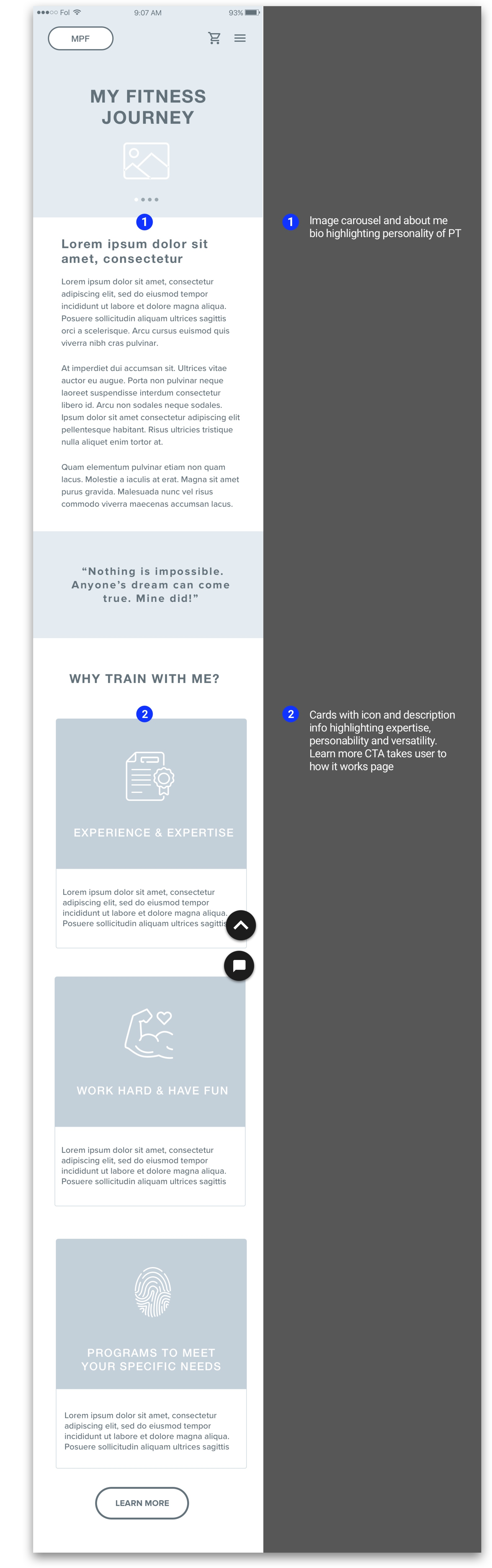
A hero video of the personal trainer on the homepage gives users an insight into their personality and how they train their clients.
An image carousel and description on the homepage highlights versatile programs.
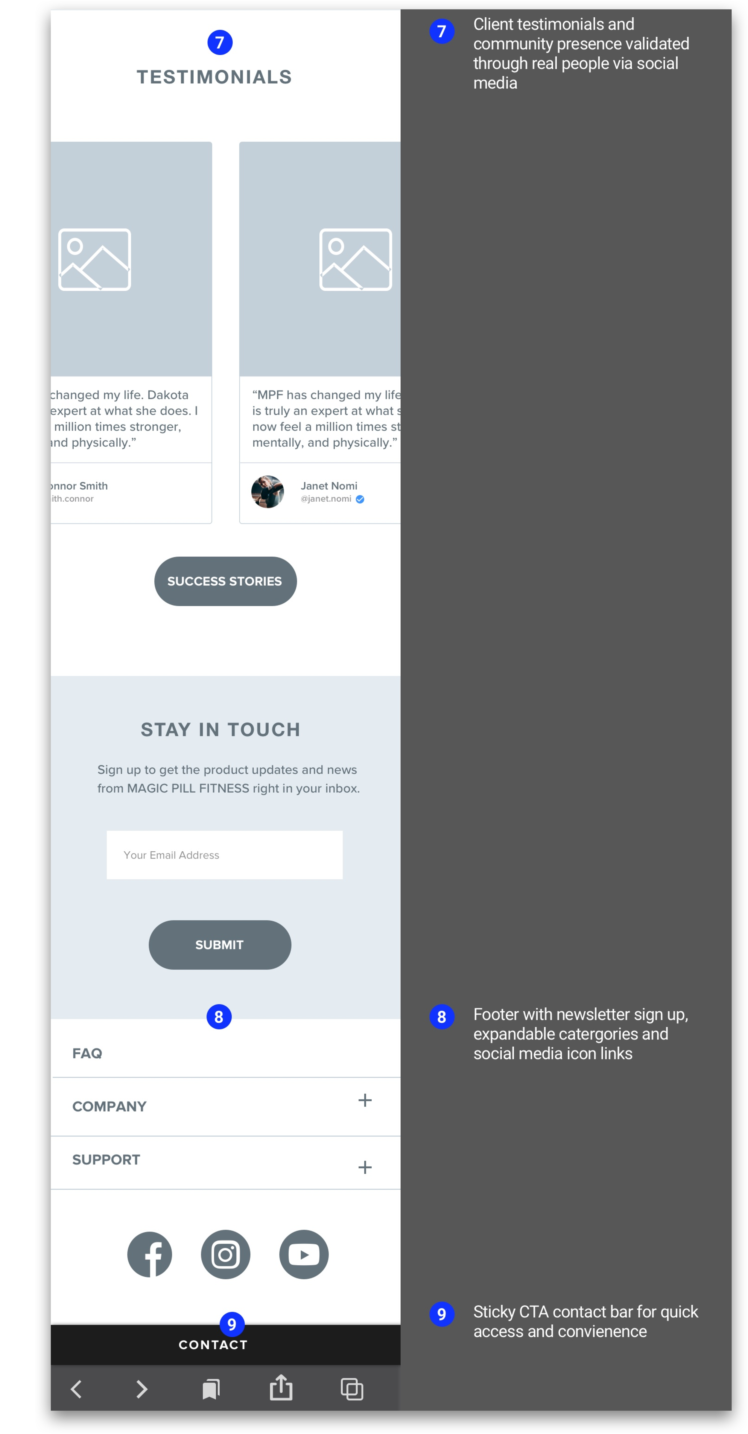
Client testimonials get validated through real people via Instagram social media links.
Credibility gets confirmed through "success stories" as well as specific "experience and expertise" content on the "about me" page.
I focused on visual and usability principles to guide people in their different buyer journeys.


Defining Brand Identity
I created a mood board to set up a visual brand direction and use it as a resource to keep the style and aesthetic consistent with my client's goals and expectations.
Magic Pill Training represents authentic, powerful, evolving energy shown through dynamic architecture, raw textures of nature, and abstract patterns. A feeling of boldness and minimalism is present through san serif fonts. Images reflect hard work and spark motivation for a challenging yet exciting journey ahead.

It's essential to be easily recognizable, marketable, and exhibit variation and flexibility in a modern brand identity system. I kept this in mind while designing Magic Pill's logo. After bouncing a few ideas back and forth and talking through several iterations, we narrowed our decision to options 1, 2, and 3 as we felt 4 & 5 resembled a cell phone signal.
We finally decided to proceed with option 3 because it exudes a contemporary and trustworthy feeling.


To use as a visual reference for design language, I created a style tile. The one-page design guide included the logo in responsive formats, fonts, colors, and more. My goal was to tell the brand story in an accessible, client-friendly manner.

Hi-Fi
After defining the brand identity and laying down the site's basic structure, I started adding detailed visual features that would allow me to get feedback on specific elements and features during usability testing.


Responsive
Once high-fidelity design layouts were confirmed, I created responsive designs for key pages so that content and elements automatically scale to match the screen size on which it is viewed.

Design System
I built a UI kit of ready-to-use components, including responsive logos, navigation, footers, buttons, card layouts, and more. This kit will keep future designers and me from drawing UI elements from scratch and will help with streamlining the entire design workflow process.


Prototype Testing
To identify potential faults and assess the viability of my designs, I created an interactive prototype for users to test. I listed a few bullet point objectives for testing:
Analyze how long it takes participants to complete a task(s) with ease and record their reactions post-completion
Observe intuitiveness of design and how participants navigate through website design
Identify usability pain points when it comes to getting more information on services offered by Magic Pill
I provided participants a link via Craft Invision to test the prototype on their mobile devices. They were asked to carry out a few tasks and encouraged to think aloud while I asked a few questions, observed, and recorded notes.
Click Map Testing
I carried out some click map tests to identify navigational gaps and see if users would click on primary CTA's, graphics, or links to get to their destination. I provided participants a link via Optimal Workshop and asked them to complete a few quick tasks.
Overall, users understood the area they need to click to get to their destination. While some participants missed target click areas, all participants did click in the correct vicinity. Linking more elements such as graphics and text and adding more specific CTA's and links could better suit visitors' expectations.

Usability Insights & Iteration
When testing was complete, I synthesized findings into an affinity map to evaluate and prioritize updates.
Based on testing and observations, all participants felt the navigation flow was easy and "has good structure" while completing the tasks. Participants understood each page's purpose and were attracted to the high-quality images, social media testimonials, colors, and fonts. Users had a few suggestions on re-wording, adding menu and button titles, and adding some information they felt was missing. All in all, participants were pleased with the website and felt just a few minor changes were necessary.

After sorting and analyzing user feedback, I created some design updates for future testing. Since most edits weren't too time-consuming, I developed solutions for most suggestions. Some improvements included adding a COVID link banner, modifying call-to-actions for clarity, adding options contact info, and more.


To be continued…
This project was an excellent opportunity to work one-on-one with a local small business stakeholder. Conducting research was eye-opening and allowed me to empathize with users regarding their online personal trainer buying journeys. It was interesting to see how big of a role social media plays in different users' journeys. If I had the opportunity to continue work on this project, I would love to build out the remaining pages of the site and test again, focusing on social media and community interaction.